|
|
Kenny Goh
|

You can make a difference to your learners
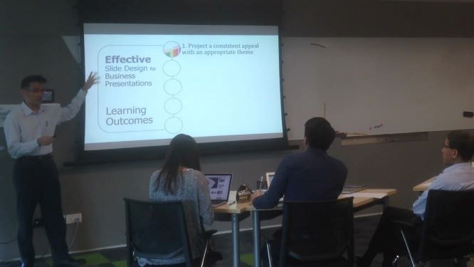
Making slides can be as easy as ABC, by just writing lines and lines of text. Yet, making good slides is also as difficult as publishing a bestseller. How do you hold attention?
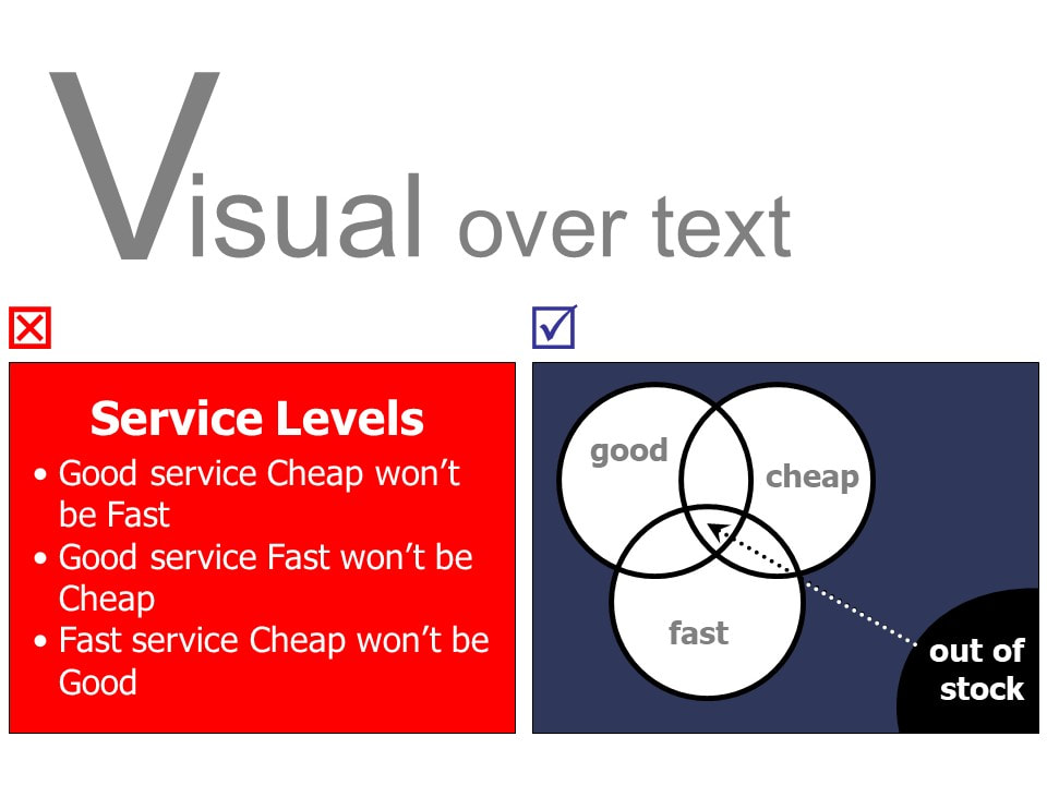
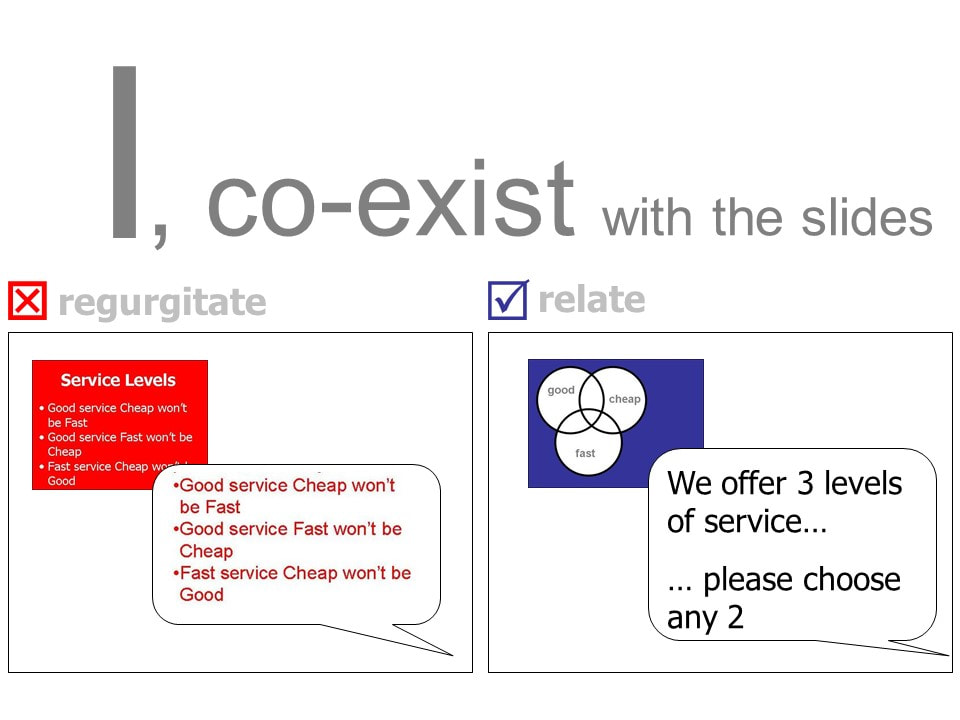
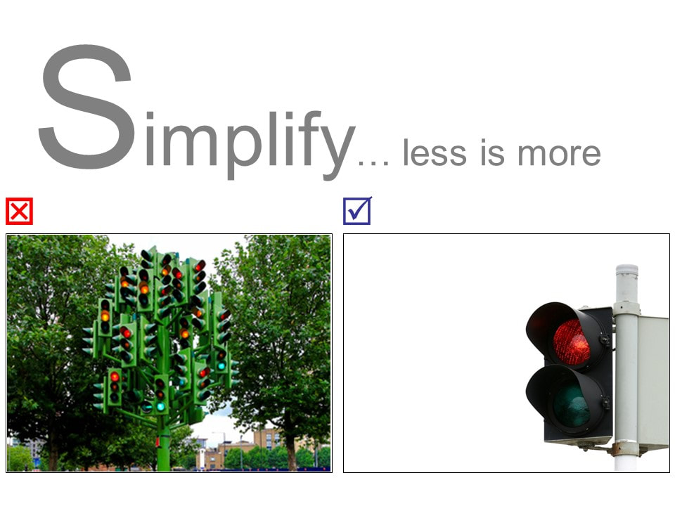
For sure, you'll find it challenging to hold attention with cluttered slides full of bullet points, like mine 15 years ago.
Today, I try to keep my slides simple. Remember, simple doesn't mean simplistic. Your slides can still be visually appealing even with textual information, as required in most training and business slides.
So, why a change from text-heavy bullet-point to text-light visual slides?
Thanks to this gentleman Nicholas B. Oulton (author of Killer Presentations) who visited Singapore in 2005 to bid for a government project. My team was fortunate to learn from him firsthand at a breakfast talk and experienced a turning point that morning.
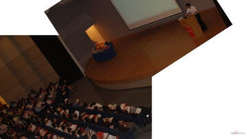 Kenny Goh presenting as a trainer
You can learn from him too.
But where do you start?
Don't worry, I've done the homework for you.
And practiced in front of large crowds over the years.
In the next 5 days, I'll share with you 5 surprisingly easy tips to make effective visual slides.
Effective doesn't have to be decorative. Instead, designs must be intentional and strategic. For marketing presentations, the audience might not be the key decision-makers and have to go back and share the message they hear with others.
As for training, active trainers help learners retain and recall information to apply in their work environment.
You can Make Photogenic Slides too -- eye-catching slides that leave a longer impression on your learners. Are you ready to take the challenge and experience the change in slide making?
(This course teaches you to apply concepts, so it doesn't matter what software you use: PowerPoint, Keynote, Google Slides.)
|
|
VISUAL Presentation Principles: 7 ways to engage your audience in your next presentation (click on image to enlarge)
V
|
I
|
S
|
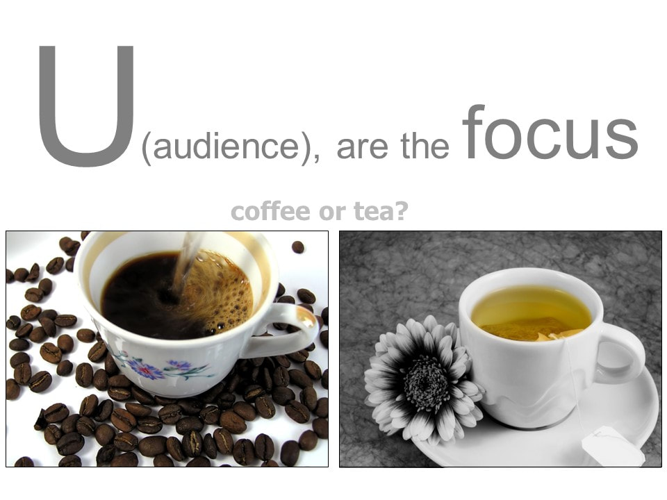
U
|
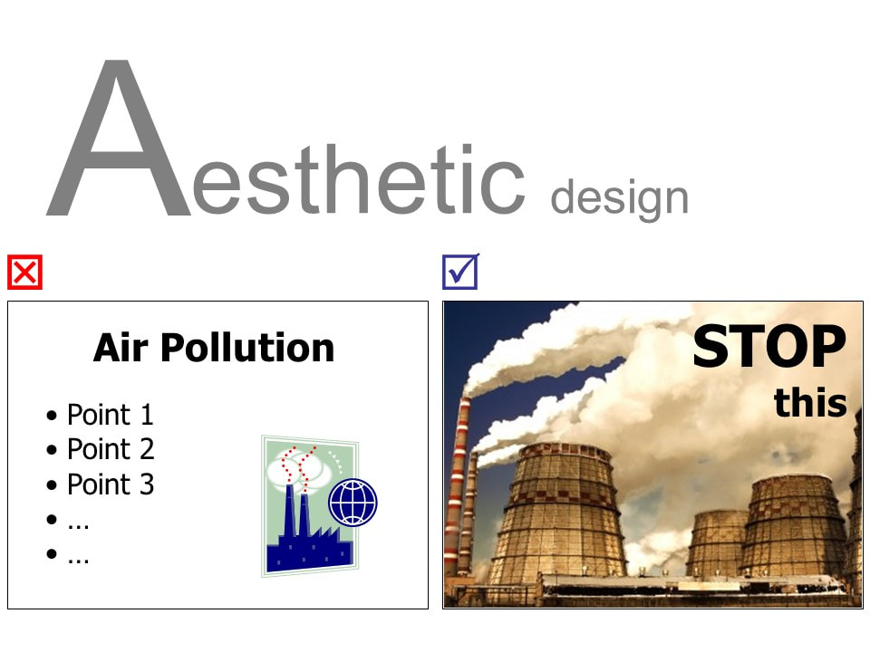
A
|
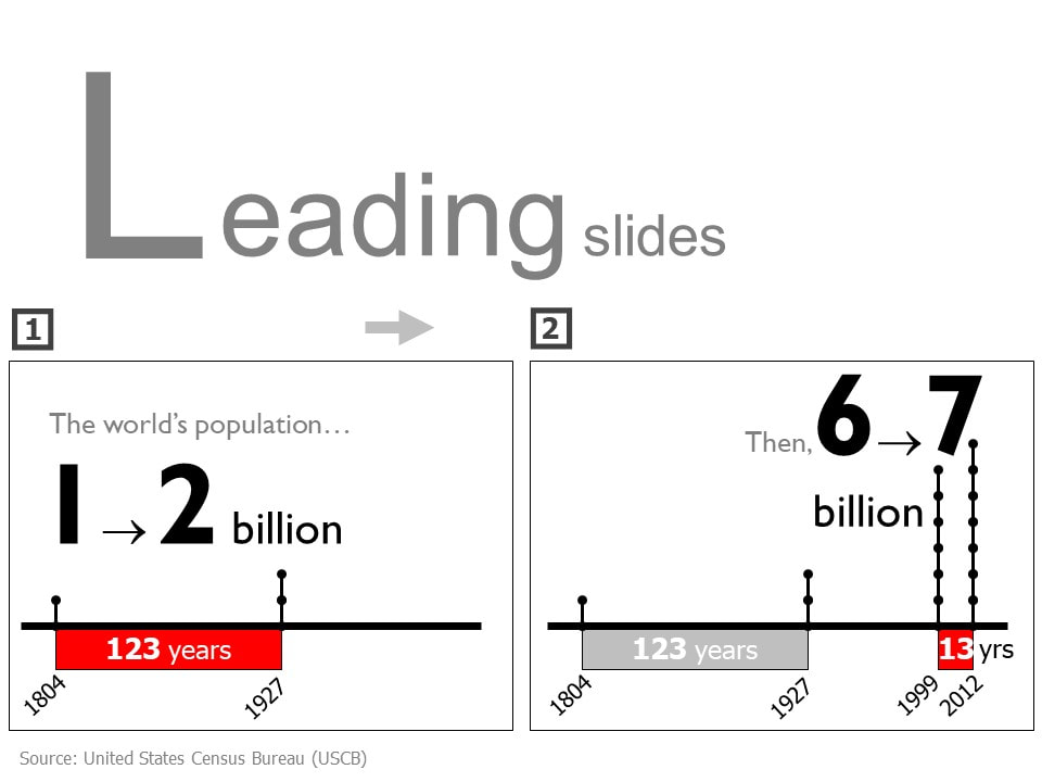
L
|
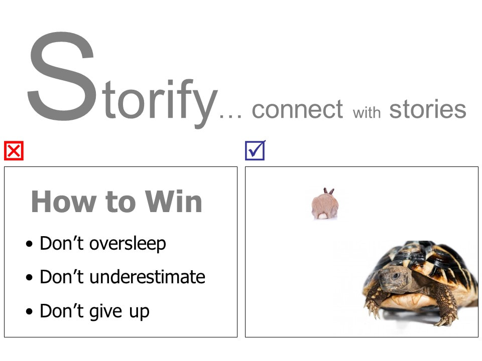
S
|